Tuesday, February 1, 2011

Joanna Newsom

Played around some more with these textured brushes and decided to do a portrait of Joanna Newsom (I'm surprised it's taken me this long to actually do a portrait of her). For some reason, whenever I think of her, I see the colors pink and gray. Her music is much more colorful, yet the association is there in my brain whether it makes sense or not. Brownie points if you can name the constellation around her neck!

Tuesday, January 25, 2011

Doodling


Played around with some brush settings in Photoshop (not something I do often) and started having fun with the dual brush. Loving the subtle textures i'm getting out of each stroke.

Sunday, January 23, 2011

Tribal Law 2


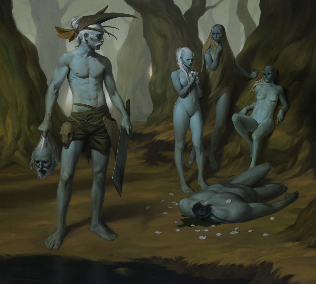
Hey guys. So this post is pretty late due to the fact that I decided to have an extended stay in Baltimore, spending time with my brother who was moving to the Philippines (he arrived safely there yesterday). Once I got back to New York, I jumped right into refurbishing this piece with fresh eyes.

I really did rush to get it onto the blog before leaving for Christmas. Definitely a lesson learned there, but I am very glad for all the feedback and critiques that lead me to this point. It's most definitely still open for criticism, so don't hold back. Hope you enjoy it.

Wednesday, December 22, 2010

Tribal Law

This is something I've been working on sporadically in between jobs. It's sort of a companion piece to the Tribal Tech image I posted not too long ago. I decided to finish it or at least get close to finishing it before I head back home for Christmas. I think I'm happy with where it is right now, but I do look forward to tuning it up when I get back to NY with fresh eyes. Happy holidays!


Monday, November 8, 2010

Old Man

A sketch I did this morning in charcoal and pencil. 11 x 14

Saturday, November 6, 2010

Sex and Violence, Round 2

I decided to go back into this one and mess around with colors. Decided to go for a very simple graphic look, with some lightly rendered areas for emphasis. Been getting a few questions as to whether or not I would be turning this into a print, so feedback is more than welcome before all that happens. Hope you like it!

Saturday, September 25, 2010

Perfect Chemistry

A piece done for the cover of the 2010 Directory of Illustration brochure. This year's brochure theme was "Perfect Chemistry." The large gold central atom was meant to be cut out to reveal the 28 on the next page, or for the 28 to be printed 0vertop with some sort of special ink. You might notice the composition is somewhat odd because the right half will be the front cover and the left half will be the back cover.

This was a lot of fun to do. The challenging part was getting the lighting to feel believable even though it's coming from everywhere.


detail